7TH AVE APPS
Designing a New Social Media Platform for the Global Black Experience
Services : Brand Design | App Design | Web Design | Marketing Design
")
The Challenge
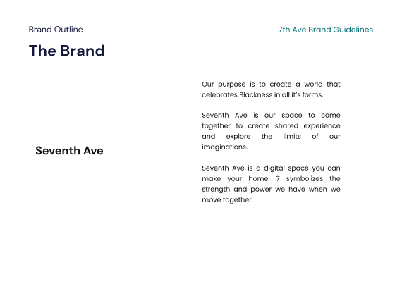
Seventh Ave was founded during a time of unprecedented change. In 2020 the world dealt with Covid-19, social distancing, and a rising tide of social justice movements across the US. Most of us didn’t know what to make of the hand we were dealt, so we stayed home and tried to keep sane.
This era of social distancing has had an impact on consumer needs and behavior. People wanted a way to replicate the connection they felt in person. This ushered in Clubhouse and a host of real time audio social media platforms. Audio as a format is a huge deal for social media. It’s opened up a new world of access and more human interactions.
Audio has allowed everyday people to connect with celebrities, thought leaders, and interesting folks everywhere.
The founders of Seventh Ave saw this trend, but also took note of the trend within the trend.
If you pull back the hood, you’ll find that audio has seen explosive growth and the people driving the culture and adoption of the platform were largely people of color.
In the wake of injustices towards black people at the hands of law enforcement, the community was crying out for a voice. They wanted a place to come together, share, feel heard.

The Solution
They wanted their brand to feel:
- Unapologetically black and proud
- Warm
- Joyous
- Inspirational
- Culturally Relevant
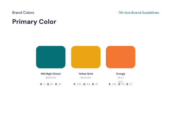
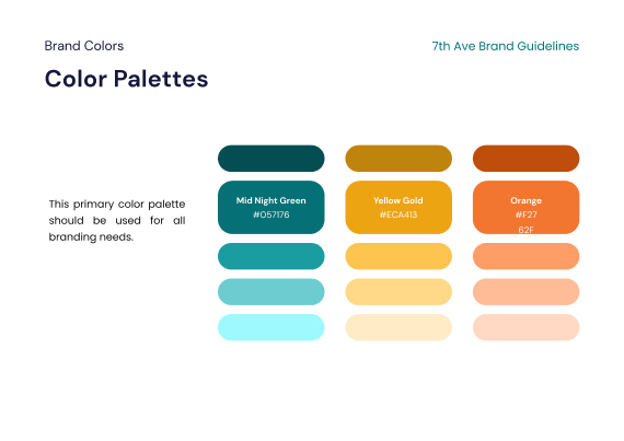
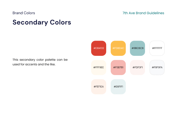
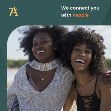
To communicate this essence in the brand, we chose a color palette that was vibrant and youthful, but still cool and sleek. We chose colors that were rich like honey and felt like melanin. It has variety, balance, and it’s flexible across mediums, styles, and formats.

Logo Design
For the logo, we explored several different paths. We spent 3 design sprints going through different ways to articulate what seventh ave stands for. We took time meditate on the brand purpose, then we outlined several creative territories to explore that showed promise.
In evaluating each implementation we accounted for stakeholder and user feedback. We also created explorations around what the implementation looked like to give the team a realistic point of reference
A more luxurious style logo that felt reminiscent of a fashion house.
This came from drawing the connection between Seventh Ave and Fifth Ave, Saks Fifth Ave, and the luxury fashion house space. We looked to fashion brands for inspiration as they play a unique role in representing universal standards of “Cool.”
In addition — Just as 5th ave is an historic landmark, so is 7th ave. This is strengthened by the strong interconnection between black culture and fashion.

")
Playing off the concept of 7th ave as a physical street
This was a literal interpretation of the name. The company chose “Seventh Ave” because you’ll find a 7th avenue in most popular cities across the U.S. Be it Los Angeles, Philadelphia, DC, Miami, Denver, St. Louis, Houston, you name it.
There’s always a 7th ave. And it’s usually either the main street or near the main st. For example, in D.C 7th ave is where Howard University is, a historic African American landmark, rich with culture, legacy, and history. So we created explorations on what a sign post concept logo would look like.
Designing the logo around the concept of the audio platform and social justice theme
This was a strategy to build the brand around the product itself — the technology. We also looked out designing the logo around the concept of social justice and empowerment. We veered away from this direction as this interpretation was too literal.
Abstract typographic representations of 7th ave as a place where everything comes together
In our discussions with the team we found that we wanted to zoom out and build a brand that would be more flexible. Something that you could wear on a t shirt without even knowing its a tech company, just bc the logo looks cool and trendy.


Style Guide

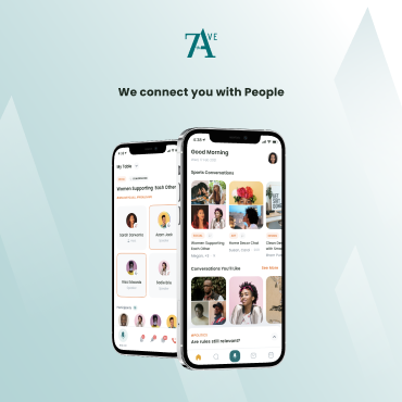
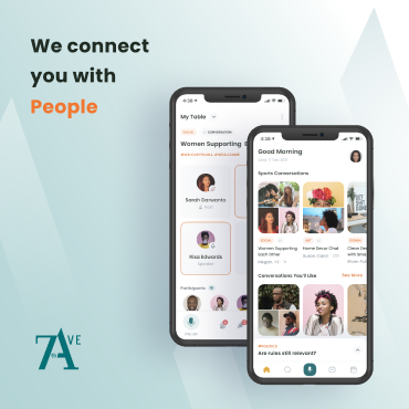
App User Experience Design
Once we created the foundation for the brand, it was time to get into the really fun part — designing the app. The bread and butter. The team came to us with a strong product vision. This is by no means a “social audio” app. Social and audio are just features. The goal was to build an interactive hub for the global black experience.
The eruption of social audio didn’t just mean people needed this feature. It meant people were looking for more ways to connect and feel closer together and the people driving this eruption happened to be the people who need it most. Black people everywhere are always looking for ways to come together, and they’ve been making due with platforms that weren’t necessarily designed FOR them. Despite the fact that research has shown that the people of color are the superusers of Facebook and Instagram. They are driving the genesis of culture on the creator/production side. And they are driving engagement and consumption on the consumer side.
So we know that:

The team came to us with product specs, so we started with a rough idea of the feature set. It was just up to us to put the pieces together.
We built the new product around 6 pillars.
In fact the original concept for 7th ave was called “The Cookout” for this very reason. We took their original design explorations, applied our new visual design system, and reimagined it with all the bells and whistles.
Connecting
The Profile
The profile was a critical piece of the experience. The design was inspired by two key insights:
- How people are currently using profiles in audio apps
- Creating a way for people to share their authentic selves
People often had very long bios that highlighted their career, credibility, personality, and more.
We took this insight and reimagined an interactive and personalized profile experience.


Instagram posts
Because this has become’s everyone’s general calling card, portfolio, and main point of reference.
Tweets
Because this a space where conversations happen. It’s common for folks to tweet about the rooms they’re in, or going to be in, or their experiences in conversations.
Spotify Playlists
Because music plays such a key role in how people connect. So many rooms were about music connection. The culture of exchanging playlists has permeated all social media platforms and popular culture, but there’s never been a structured way to do so.
So we created away for people to:
Share their basic info Occupation, location, alma mater, associations. These are always the starter points of conversations and getting to know people. “So what do you do?” or “Where are you from?”
Share their takeaways from past conversation experiences in the app What better way to get to know someone than to hear their thoughts on their favorite conversations? Takeaways take the ephemeral moments of conversation and allow you to capture the moment.
Share who they are through fun personality prompts
When we were studying how people connect, we looked at several different verticals. From social media, to events, family dynamics, and even dating. Not enough people are talking about the evolution and transformation of online dating culture. It’s gone from something taboo, reserved for the outcasts — to a normal part of every day life. In fact, the innovations in social dating was an inspiration for how thought about the profile. This is because how they helped new people connect for the first time.


The concept of card game experiences was also implemented by Houseparty, the video hangouts app that has quietly gained dominance among Gen Z. Houseparty is known for creating interactive games you can play on video/facetime calls. This has been shown to help people connect and hangout.
So we took inspiration from both of these insights to create our own prompts for people to share fun facts about who they are and what they care about. It’s almost like virtual speed dating. Which is what we found people are doing when browsing profiles.
Engaging
Feed
The feed is a core part of every social app. However, our approach to the feed was slightly different. Once the user goes to the feed, their view changes and all of the focus is on the content.
Immersive
The feed was designed to be immersive. Drawing inspiration from one the most popular apps in the world right now — Tiktok. One of the reasons TikTok is so engaging, beyond the content and algorithm, is how they fully immerse you in the content when you’re browsing. It replicates the experience of being at a movie theater. All of your attention is on the content.
Creating space for conversation
Conversation is the precursor to connection and a foundation of the app. So we created a way for people to use feed content as a jumping off point for conversation. There is an easy entry point to create a convo experience and in the conversation itself, the topic/post will be pinned to the top.

Engaging
Audio Experiences
Audio is just a feature, but it’s an important one. It’s one of the closest thing we have to being hanging out socially in person. So including social audio and the ability to schedule conversations was tablestakes.
But one of the limitations of audio is the fact that only so many people can talk at once. Which is why we created a live chat feature so that people can be a part of the conversation, even if they’re not on stage.
Another challenge with audio is that it’s ephemeral. There are so many priceless moments that happen in conversations. You want to be fully engaged, but you also don’t want to lose the gems you’re getting.
So we created a takeaways feature that allows people to share their takeaways and thoughts, almost like a tweet or personal diary of highlights. This allows people to capture the moment whenever they want.
And to reward community builders, early adopters, and people driving culture we created a gamified badging and points mechanism to drive engagement.

Discovering
Explore Feed
Another insight we found in our observations, was the user frustration with the browsing experience of Clubhouse. When you logged in you were subject to whatever conservations were happening at that moment based on people you follow. There was no way to segment or filter through conversations to identify the type of experience that matched your mood and needs at that moment.
So we designed an explore feed, categories, and hashtags to help people find the experience that they were looking for.

Discovering
Cross Platform Sharing
Sharing is a critical piece of the social feedback loop. It’s what allows things to spread virally. We observed that people often tweeted about clubhouse rooms they were in or screenshotted them to post on instagram. As social media has become more of a utility, cross platform sharing has become a de facto. Which is why Apple and android have added quick access controls to facilitate this. It’s also why Spotify and other platforms have created engaging visual templates for sharing music on social media.
Sharing is status signaling, it’s promotion, it’s expressing what you care about, and it’s a must. So we fixed the broken experience of screenshotting and sharing links, by creating custom templates to share conversations across different platforms with the click of the button.
This is easier for users and since there’s a visual template, it incentivizes people to share. By designing a share template it makes people more proud to be associated with the brand. It now becomes cool to share, not spammy.
Website
With this design, we had a few goals:
Introduce the brand and the product
Provide context on the company and team
Providing an engaging onboarding and logged in experience
Introduce the brand and the product
We did this through the landing page. Our use of imagery communicates the experiences the brand creates and who they represent. We keep things short and sweet by sharing a quick blurb on the story and placing the main focus — the product pillars. We use big, bold UI shots to draw people in. We use the brand colors as the background to capture the vibrance and warmth of the brand.
")

Providing an engaging onboarding and logged in experience
Since the app is still in pre-launch beta, there was a focus on driving registrations. But if you don’t want those leads to go stale waiting, you have to provide some type of value to them up front.
We solved this by finding an intersection of the brand’s purpose and what users are looking for. Seventh is about creating a space for people to come together. While the audio experiences are still being built out, we use content to keep people engaged.
When people register on the website, they create an account that will be used for their account at launch. Once they login on the site, they’ll get access to curated playlists, content, tweets, and more. They’ll even get a sneak peak of the app. They’ll also be able to access the web version of the feed to see content being shared on the ave.
Provide context on the company and team
The product is usually what people care about. But with startups, the defining factor is the team. And Seventh ave is fully stacked. So we created:
An about page for them to share their principles
FAQ page to answer common questions
A contact page to get in touch
A brand partnerships page for potential collaborations
")

Pitch Deck
In designing the pitch materials we updated the visual design and the content. We provided an overview of the product, and also a set of slides the partnerships team can repurpose.
We designed the deck in a way that was visual, modern, trendy. We also wanted to make sure it was not encumbering and still easy on the eyes.
This pitch deck was a significant upgrade from the team’s first draft. Their initial version was simple and straight to the point. But in terms of visual design, it felt a little flat and there was a lot of room to make the deck more visually engaging and better communicate key messages. There was also a big opportunity in making the deck feel more representative of the brand.
One Pager
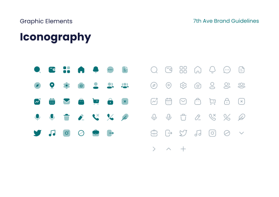
For the one pagers, our goal was to create a simple design that would introduce the company, the product, the vision, and key differentiators all in one synthesized view. We leveraged the two tone layout to segment information about the company from info about the product, and custom iconography to improve visual communication and scannability.
The final product is a great asset for investors, partners, sales, or anyone looking to learn more.


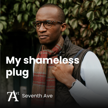
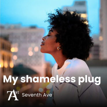
Social Media Templates
For social media, we helped them create a suite of story templates and feed templates that matched the identity of the brand and allowed for multiple use cases. This included image styles, UI driven posts, community spotlights, social headers, and more.

Results
Our rebrand has played a massive role in the relaunch of the company. Our design system has positioned them for long term success by creating scalable templates that can be adapted for new use cases. Our designs have also tested well in focus groups and user interviews.
In board reviews, our designs received high praise from the Head of Design at Twitter and the Obama Administration. The design has played a key role in the company’s ability to secure funding, partnerships, and continue to scale.
Parting Thoughts
This project was symbolic in many ways. The Seventh Ave team had some of the best investors, advisors, and product teams that we’ve worked with. We fostered a safe space for critical discussion and allowed good ideas to come from everywhere, regardless of whether it came from marketing or engineering.
This was also a fun project because we saw the arc of the company story happening before our eyes. We remember being in San Francisco when one of the investors in our network invited us to Clubhouse. I remember being fascinated, inspired, even a little addicted. But at the same time I saw so many usability and design opportunities. So it was fulfilling to get a chance to rebrand and introduce a new product to challenge the incumbents.
We’re glad we got a chance to work on the entire company from end to end. It’s humbling to know that our product and design work will play a critical role in securing future rounds of funding and ensuring the success of the company.
Can’t wait to see you all on the ave.
In board reviews, our designs received high praise from the Head of Design at Twitter, the Former Head of Sports Partnerships for the Obama Administration, and the CMO of a Fortune 500 company.