AWIPAY

The Challenge
AwiPay is a digital wallet that allows Caribbeans consumers to easily manage their day to day financial needs. It saves people time and energy and connects them to a variety of services under one roof.
AwiPay was founded because Caribbean access to mobile and internet technology is growing rapidly. Society has begun shifting from cash to credit. Digital payments will inevitably become a necessary utility. AwiPay has the opportunity to lead the charge as the first Caribbean digital wallet.
They came to us because they needed to do a complete overhaul and redesign of their app. They had the technology and the team down pat, but they decided to go scrappy in the beginning and made their design…*gulp*…. in Powerpoint.


Would you be excited to use that app?
Would you truly believe that they were about to transform an entire country, region, and industry?
Would you trust them with your personal financial info and ID?
Yeah….Kinda iffy.
You can’t put your finger on it, but something isn’t quite right. The team knew they could do better but didn’t know where to start. That’s where we came in.
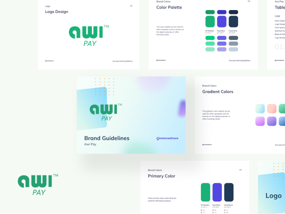
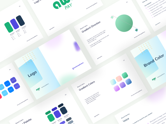
We understood that the reason the design wasn’t hitting was because of: poor color harmony, inconsistent styling, no real visual rhythm, an archaic design system. It really feels like something from the 90s that was made in Microsoft paint.
But sometimes the value-add of the product is SO strong that poor visceral design doesn’t stand in the way.
But in today’s economy, people expect beautiful and delightful design. Especially if you’re trying to take market share from big household brands. So we wanted to help AwiPay develop a brand identity and design system that matched the power and esteem of the mission.
The Solution
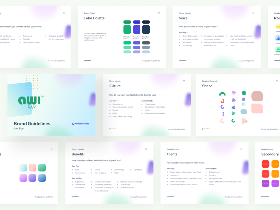
In our discovery session and audit of the app, we understood the intention that was lost in the execution. They wanted AwiPay to be more than a digital wallet, it’s a movement. AwiPay stands for empowerment, liberation, and fun. Unlike their stodgy predecessors, AwiPay lives and breathes culture, staying true to their Caribbean heritage.
In their original design they attempted to convey this with the header showing people at a festival, and the Jamaican inspired yellow-green gradient. We helped them update their brand identity and design system to better convey their ethos visually.

User Experience
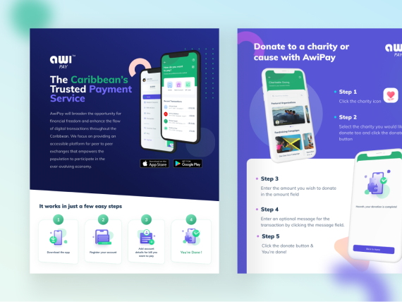
What makes AwiPay special is the fact that it allows you to pay for all your bills under one roof. You can pay for your phone bills, go shopping, donate to charities, or send money to your friends. It truly embodies the idea of a digital wallet.
To communicate this through the design we created a system of modules to connect the user to the services they need. We thought the modules to be the digital equivalent of the slits of a wallet. You thumb through to find what you need when you need it.

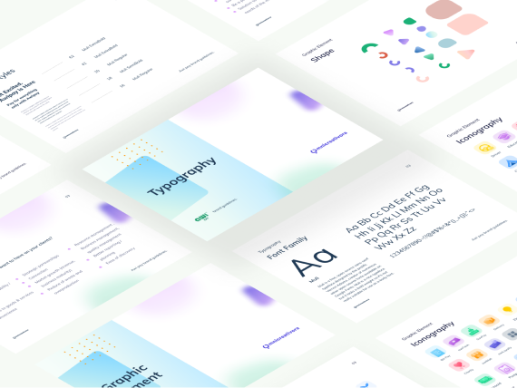
Iconography


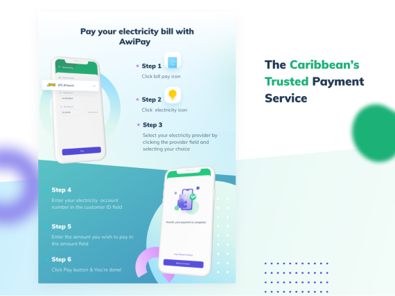
Pay Bills & Top Up
Paying your bills has never been easier. From electricity to insurance to top up, you have everything you need to stay on top of things. All you need is your account number, service provider, and how much you want to pay. We’ll handle the rest.
Send and receive money
AwiPay lets you link your bank to send or receive money to anyone in your contacts. You can use their phone number, bank account, or QR code. You’ll also have access to our online banking and budgeting tools.

Donate to Local Charities and Churches
Give back and make an impact where it counts. All of your donations go directly to the organization you choose. Donations are 100% secure. We want to do our part to build a stronger community.

Refer Friends for Rewards and Prices
Invite your friends to join the app and get rewards and prizes points that you can exchange for coupons and great deals at your favorite stores, businesses, and restaurants.

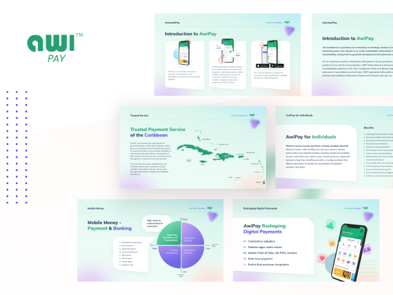
Brand Marketing Design
As they were preparing to launch their sales and marketing campaigns, they needed to make sure their brand felt cohesive, professional, and consistent. So no matter if you were reviewing a sales presentation, a flyer, or a social media campaign — you felt like you were interacting with one brand.
Aesthetic consistency is fundamental to building a brand. It enhances recognition, sets expectations, leaves a lasting impression, and allows your audience to build a relationship with you.
They brought us in to redesign their brand identity and build a library of marketing assets to use during sales, marketing, and PR.
Our Process
The goal of this project was to give AwiPay foundational brand marketing assets. But before jumping into the asset design, we needed to create a brand strategy to underscore all of our efforts.
We started the branding process with a design workshop. We worked with them to outline their brand values and positioning using the CORE Discovery method. This helped define:
Sales and Partnerships Assets
To design the rest of the assets we needed, we had to first understand their marketing funnel.
We started by defining all of the various use cases where marketing materials were needed and how they are going to be used.
The two primary use cases were:
- Partnerships and business development
- Marketing and advertising to consumers
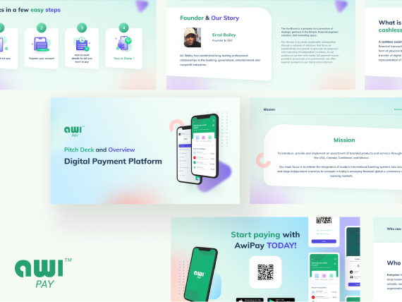
On the partnerships and biz dev front, they needed assets to support their sales presentations, pitches, and email marketing. So we designed:
- A Pitch Deck
- Templates for Sales Docs and One Pagers
- Flyers

Social Media Assets
On the marketing front, they needed a full social media kit. This would make it so their campaigns would be immediately recognizable. So we designed.
- Headers
- Cover photos
- Story posts
- Feed Posts
- Video templates
- App Store Assets
We created dedicated templates for all the different types of content they’d be publishing. We also designed several variants with different color themes to create visual diversity and reduce redundancy.

